Using the PVX Graphical Interface
Access Through a Web browser
We assume here that the probe has been previously configured through
the command line interface and the user knows the probe’s IP
address. The probe can be accessed either with SSH or with a Web
browser. To connect with a Web browser, the port to use is 443,
but an automatic redirection will be made on the port 80.
For a physical machine, see Configuration. For virtual see Virtual Appliance Step-by-Step.
Login parameters in PVX
If the IP address of the probe has been configured as 10.0.0.1,
then just open the URL http://10.0.0.1 with your Web browser (or
https://10.0.0.1 to use the HTTPS protocol).
You can verify that you are actually connected to a SkyLIGHT PVX
appliance, by checking that the certificate serial number is
00:90:26:d5:46:2a:5e:66:ec.
To log in, please use: admin as user and admin as password.
You are now logged in and ready to use the Graphical User Interface. For best performances, Mozilla Firefox and Google Chrome are recommended.
Internet Explorer, Edge and Safari are not supported.
Network Performance
SkyLIGHT PVX provides a series of views to show how your network is behaving.
Business Critical Networks
Provided you have configured some critical networks (setting thresholds on volume and quality indicators between 2 zones), you will get a summary screen of the performance of your most critical network links on this screen. This is an auto-refresh screen, whose data can be integrated in your SNMP-based monitoring suite (if you enabled the SNMP daemon via Pulsar).
By hovering a specific time and link, you can view the origin of a degradation (latency, retransmission, excessive bandwidth consumption and in which direction it occurred).
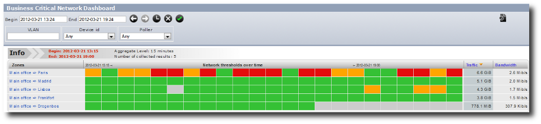
Business Critical Networks
You can access this view in the graphical interface in Dashboards / Critical Networks.
Performance over time chart
This view will show the main network performance metrics through time for a given selection (from one zone to another, for example): round trip time, retransmission delay, connection time, retransmission rate, volume of packets. This shows the evolution of the network performance; as in any view in SkyLIGHT PVX, you can drill down to the conversation level by clicking through the graphs.
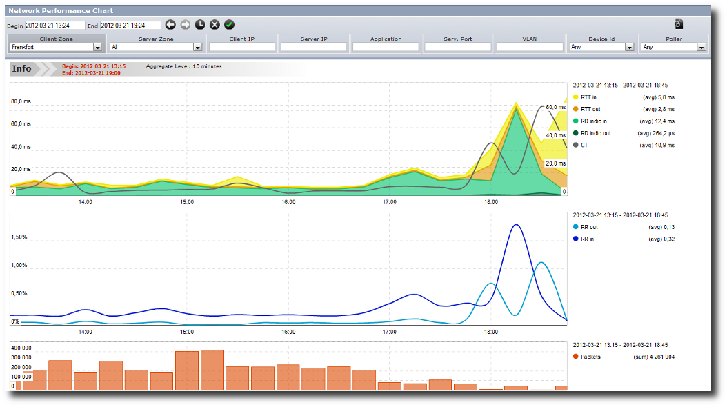
Performance over time chart
You can access this view in the graphical interface in Monitoring / Network Performance Chart.
Application Performance
SkyLIGHT PVX provides a series of views to show how your applications are behaving.
Business Critical Application Dashboard
Provided you have configured some critical applications (setting thresholds on quality for a given application), you will get a summary screen of the performance of your most critical applications on this screen. This is an auto-refresh screen, whose data can be integrated in your SNMP-based monitoring suite.
By hovering a specific time and link, you can view the origin of a degradation (round trip time, server response time, data transfer time, quantity of transactions).
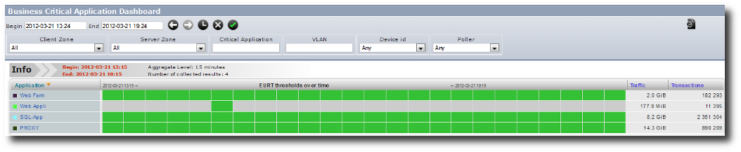
Business Critical Application
You can access this view in the graphical interface in Dashboards / Critical Applications.
Application Performance Dashboard
A simple click from the Business Critical Application Dashboard takes you to the Application Performance Dashboard. It shows you the evolution of the End User Response Time through time (along with the volume of transactions) and its breakdown in Round Trip Time, Server Response Time and Data Transfer Time. At a glance, you can understand the origin of a change in the End User response time.
Underneath this first graph, you find two additional bar charts, which help you understand which server(s) and Client Zone(s) are performing better / worse (and due to what component of the End User Response Time). The servers and zones are always presented from the one that corresponds to the highest volume of transactions to the lowest.
You can drill down and display either the Client Application Dashboard or the Server Application Dashboard by clicking on a specific server or client zone. This drives you to a specific application dashboard focusing on the same application for that specific server or client zone.
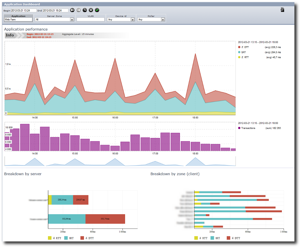
Application Performance Dashboard
This view is available for any TCP application in Dashboards / Application Dashboard.
Application Performance Chart
A more detailed view of the application performance is available here; it will show an even more complete set of metrics: RTT client & server, Server Response Time, Data Transfer Time client & server, retransmission rate, volume of packets.
Using filters, you can focus on a specific perimeter and view the evolution of the application performance through time. This view is specifically interesting to link the evolution of data transfer times to retransmission rates and data volumes.
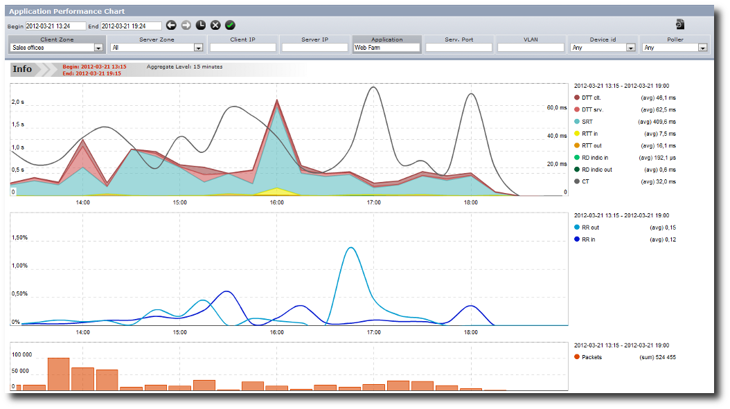
Application Performance Dashboard
This view is available for any TCP application in Monitoring / Application Performance Chart.
Bandwidth
You can graph the evolution of bandwidth through time.
From there, you can drill down to detailed conversations to display the main contributors of a peak of traffic, for example.
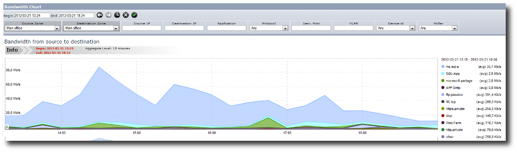
Bandwidth Graph
This view can be accessed through Monitoring / Bandwidth chart.
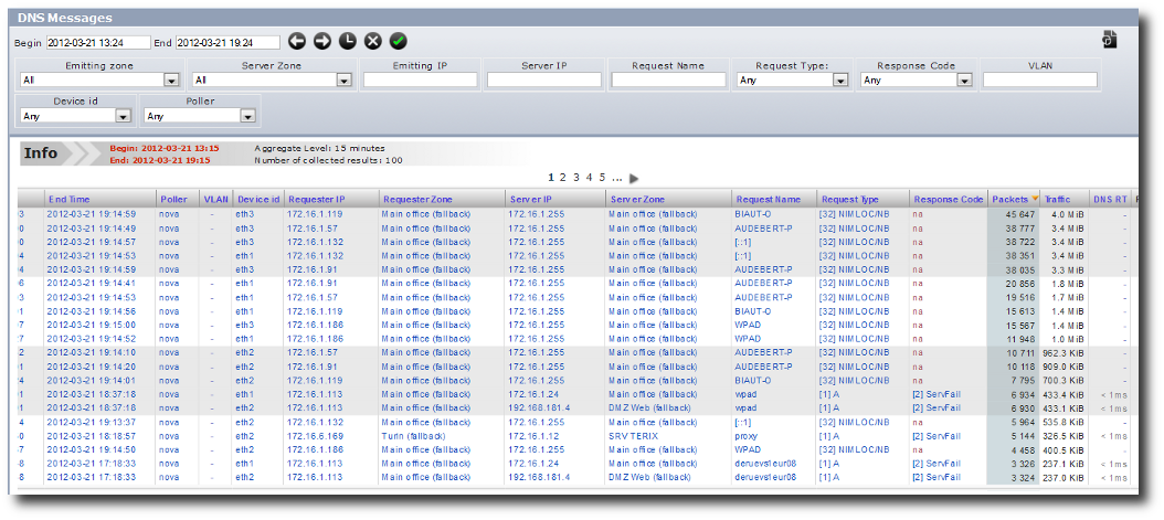
Conversations, Flow Details & Raw Data
A conversation represents the exchanges between two IP addresses. So why do we need Flow Details pages which are the same tables with more information?
Even if both tables are alike, there is a subtle difference. By displaying more information (MAC addresses, detected OS, server port, protocol stack), the flow details may split a conversation in different rows and then the network and applicative metrics are split as well. Conversations is a more synthetic view whereas Flow Details is a troubleshooting one.
The Raw Data pages are different; the results show the data as stored in the database. The results are sorted chronologically by default. For instance, it is useful for troubleshooting to know in a global conversation where exactly the packets with a high metric value are.
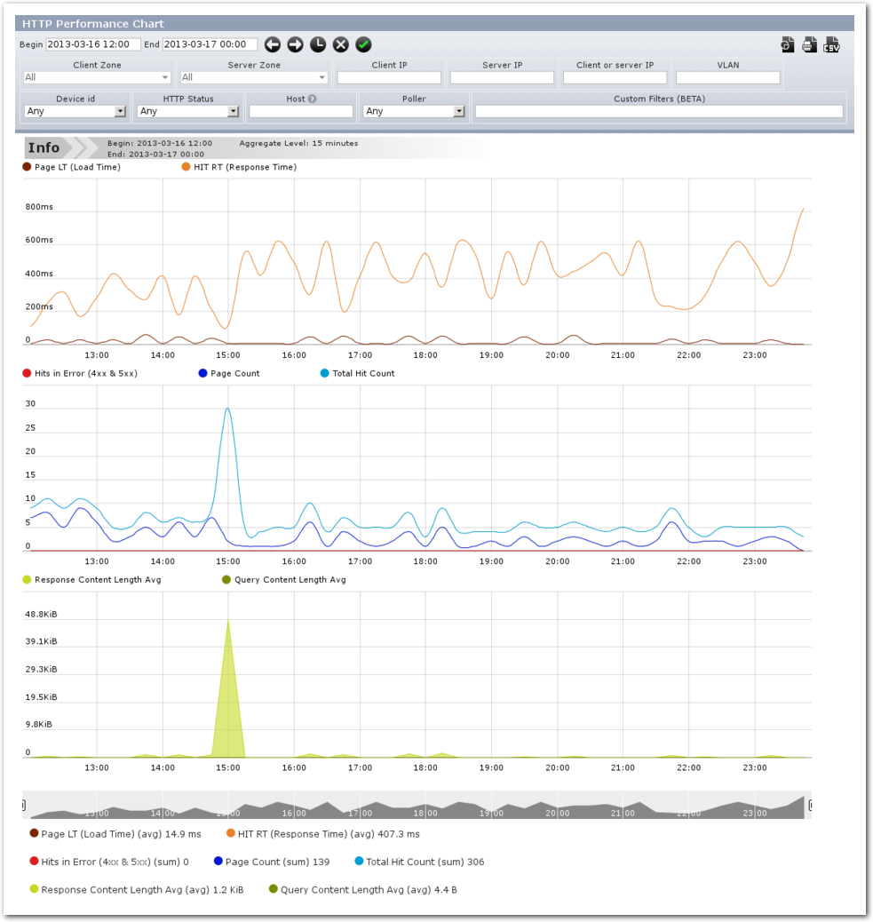
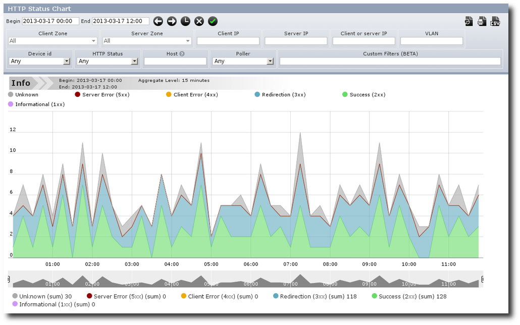
HTTP Analysis
In the Protocols section, the set of pages for HTTP performance allows you to analyze HTTP traffic.
From these pages, you can easily find the most solicited servers or hosts, according to the number of hits, by payload or by response time.
Using the graphs, you can check HTTP status and performance (including timing, error rate, payload size) over time.
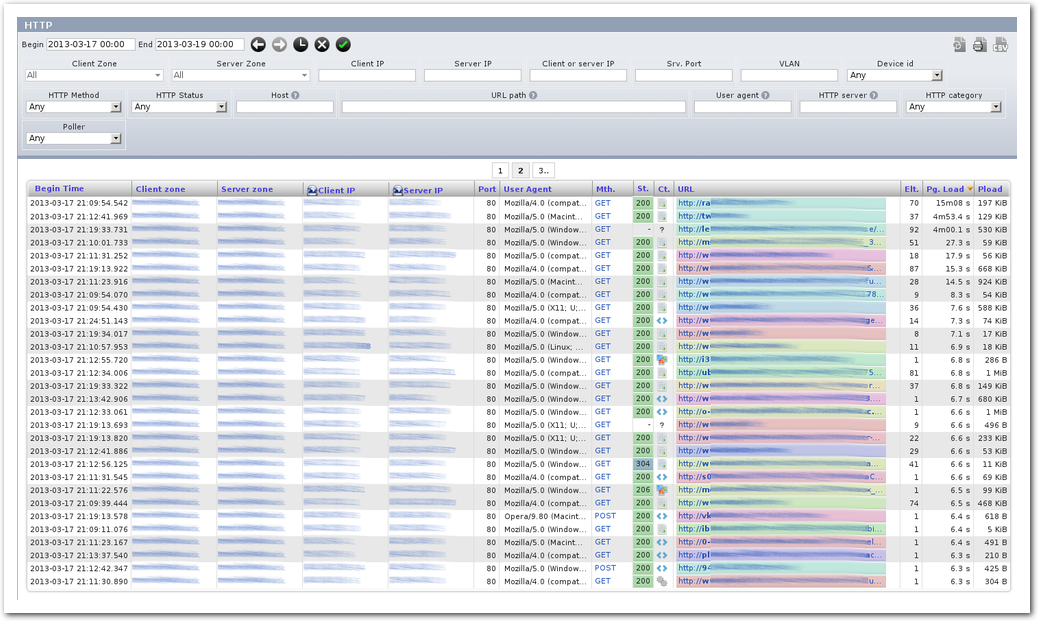
You can view the captured HTTP transactions in detail by using the “Pages” and “Hits” pages. The first one lists all the HTML pages, while the second one gives you the details of every transaction (including image, javascript, css and other resources used to construct a page.)
When clicking a page, you get a timechart of all the transactions that occurred to build the page. From this view, you can inspect how the various servers involved were responding to the client’s browser. This allows you to get a visual overview of how the page was constructed over time.
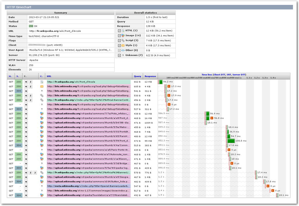
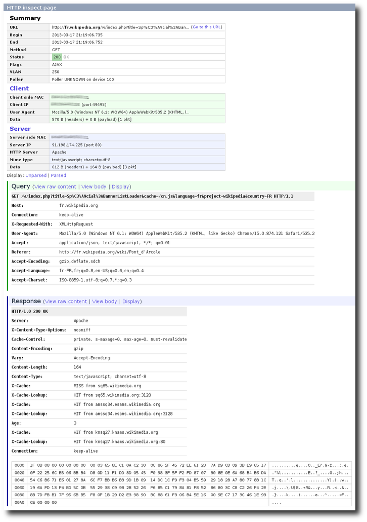
You can also display the details of a single transaction by clicking on it. This will show a summary of the HTTP query and the response, in addition to the headers and an excerpt of the payload.
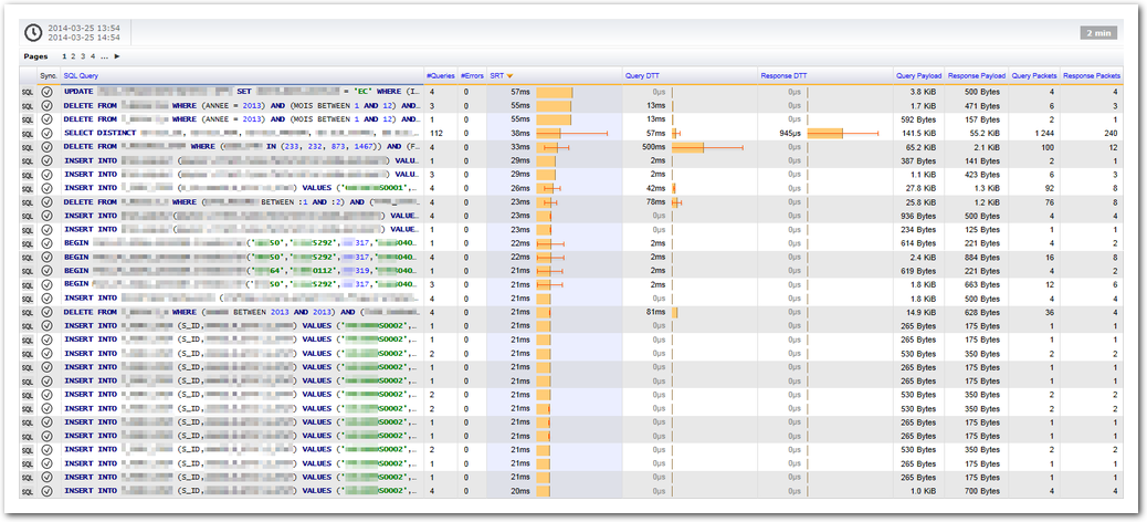
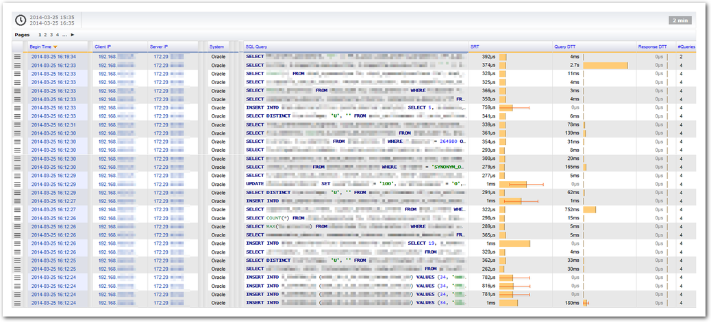
SQL Analysis
In the Protocols section, the set of pages for SQL performance allows you to analyze the SQL traffic. It shows you the queries with the usual metrics (responsiveness, payload size, SQL errors, etc) from the following database systems: DB2, SQL Server, PostgreSQL, Oracle Database or MySQL.
The capture probe should be able to decode the protocols from the following database systems:
| System | Support |
|---|---|
| SQL Server | The capture should be able to decode the Tabular Data Stream (TDS) protocol from version 7.0 to 7.4 which corresponds to SQL Server 2000 to SQL Server 2012. |
| PostgreSQL | Only the protocol 3.0 is supported which is implemented in PostgreSQL 7.4 and later. |
| MySQL | The protocol v10 is supported which is implemented by MySQL 3.21.0 and later. |
| Oracle | Oracle database uses the Transparent Network Substrate protocol (TNS). Since this protocol is proprietary and almost no technical specification is available, the decoding is best effort. It has mainly been tested on Oracle 10g and 11g with JDBC drivers. |
| DB2 | DB2 database uses the Distributed Relational Database Architecture (DRDA) in version 4 and 5. This is used by DB2 from version 9. |
By default, for performance reasons, and to keep the storage to a reasonable size, only the type of query (e.g. SELECT, UPDATE,..) is kept in aggregate levels above 1 minute. You can configure this behavior in the “Data Merging” configuration page.
Graph
The main SQL graph allows you to view the performance of your SQL queries over time.
You can graph the performance of a specific query or a specific server using the filters.
Top Views
You can request the top most solicited server (according to the number of queries or total payload, for example).
The top servers (most solicited) per number of queries.
You can request the list of queries that occur most often, or which take the longest time to get a response.
The queries that have the highest SRT measure.
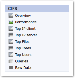
CIFS Analysis
In the Protocols section, the set of CIFS performance pages allows you to analyze the CIFS traffic. CIFS includes SMB v1 to v3 protocols. It shows the CIFS commands with the usual metrics (responsiveness, payload size, ...) and some specific ones like metadata payload or data size effectively written by the server. Of course, when a file is handled, its path and tree will be available.
The CIFS set of protocols contains plenty of commands and statuses. In SkyLIGHT PVX, we have classified the statuses in three categories: ’success’, ‘warning’ and ‘error’. You can find the details of how each status is classified in the appendix CIFS Status Categories.
We defined a category of common statuses, containing the most common CIFS errors and warnings. The list contains the following statuses:
- STATUS_NO_SUCH_FILE,
- STATUS_NO_SUCH_DEVICE,
- STATUS_OBJECT_NAME_NOT_FOUND,
- STATUS_OBJECT_PATH_INVALID,
- STATUS_OBJECT_PATH_NOT_FOUND,
- STATUS_OBJECT_PATH_SYNTAX_BAD,
- STATUS_DFS_EXIT_PATH_FOUND,
- STATUS_REDIRECTOR_NOT_STARTED,
- STATUS_TOO_MANY_OPENED_FILES,
- STATUS_ACCESS_DENIED,
- STATUS_PORT_CONNECTION_REFUSED,
- STATUS_FILE_DELETED,
- STATUS_INSUFF_SERVER_RESOURCES,
- STATUS_MORE_PROCESSING_REQUIRED,
- STATUS_BUFFER_OVERFLOW,
- STATUS_WRONG_PASSWORD,
- STATUS_NETWORK_ACCESS_DENIED,
- STATUS_TOO_MANY_SESSIONS.
To filter results by this category, use the following custom filter:
cifs.status = "common"The drilldown workflow of the CIFS metric starts with an overview of the different commands and a chart of performances over time, then continues with the Top pages: Top IP, Top File, Top Tree, Top User. The troubleshooting pages are Queries and Raw Data.
Note
In the Top Files page, the CIFS queries without any file path are removed from the results.
The CIFS Menu, from Overview to Raw Data.
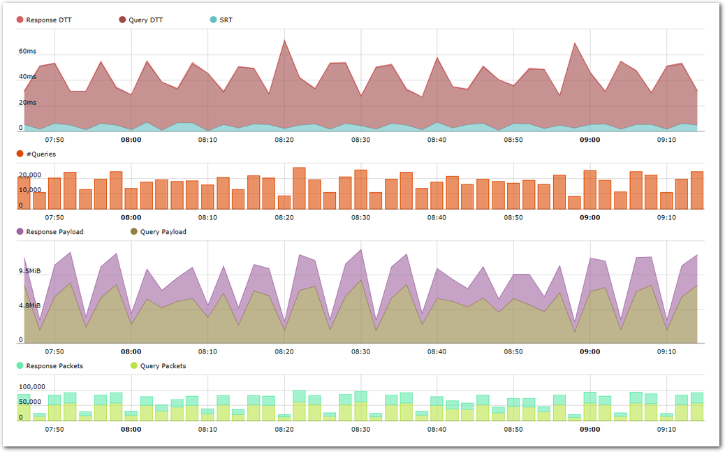
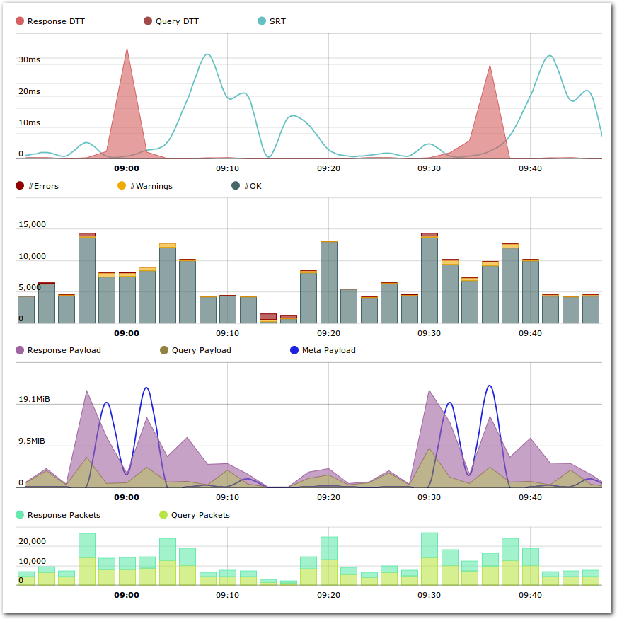
Graph
The performance graph shows lots of metrics over time. You can compare applicative performance such as DTT and SRT with the number of queries, the payloads in each direction and finally the applicative packets.
The CIFS graph with its four charts.
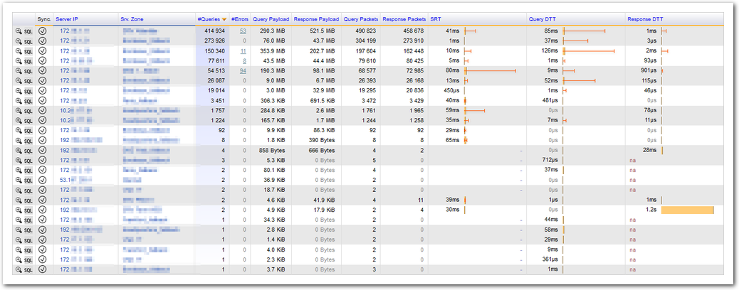
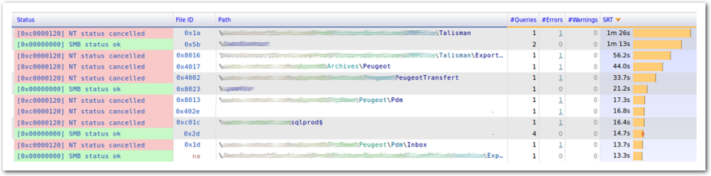
Queries
The Queries page shows all CIFS transactions in detail. It can display the CIFS transaction information like User, Domain, File Path, Command, Status with their relative performance metrics SRT, DTT and their associated deviation.
CIFS queries showing Status, File Path and SRT.
Matrix
The matrix view provides a representation of various metrics, where every cell represents the value of this metric from one zone to another zone. Each cell can contains extra values to better interpret the result (such as the number of packets used to compute a mean, and so on). This report provides a very synthetic view of the mapping of the metric which is observed.
The matrix can be used both for Client/Server and Source/Dest observations. The Client/Server matrix can be found in the APPLICATIONS section, while the Source/Dest matrix can be found in the NETWORK section.
The matrix is presented as follows:
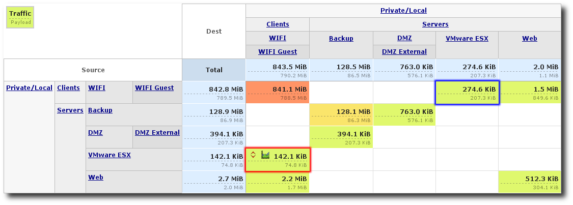
The detailed Matrix
The matrix will show a mapping of all flows as follows:
- blue cells represent the total for a zone (the sum of all the values in a row or in a column).
- green to red colored cells represent the traffic from one zone to another zone. The color represents the relative value regarding the maximum value of the whole matrix (red is the largest value displayed).
In the matrix above, we can see that there was 142KiB of traffic from
machines in the ESX zone to the machines in zone Wifi
Guest. The opposite direction, shown in blue, tells us that the
traffic on the machines from the Wifi Guest zone to those in the
ESX zone amounted for 274KiB.
There are two types of matrix presentations:
the detailed matrix, which displays a zone and all its child zones, show how zone is spread in its subzones.
The matrix above is such a matrix, where the zone local was chosen both for source and destination. We can see the zone and all its child zones.
the contextual matrix, which displays a zone among its ancestor zone. This is convenient to check which part of the network is related to a specific zone.
An example of a contextual matrix that allows us to check how the local zone fits into the whole configuration:
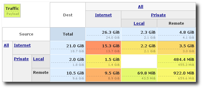
The contextual Matrix
The navigation within these matrices are thus different. The detailed matrix allows to select the zone to display (ignoring all other ones), while the contextual zone allows to select which zone to focus among its ancestor zone.
You can filter the flows taken into account by defining:
- the observation period
- the source zone
- the destination zone
- the application
- and other common filters such as VLAN, capture and so on.
Another matrix example:
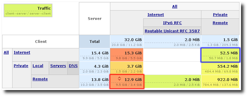
The detailed Matrix in the Client/Server context
In this matrix, we are presented with a different view of the metrics.
Here, we can observe in the red cell that all of the communications
initiated from machines in the Remote zone to the machines in zone
Internet accounted for 12.9GiB (total for both direction).
Meanwhile, in the blue cell, the communications initiated by machines from
zone Internet to those in the zone Remote accounted for
52.5MiB.
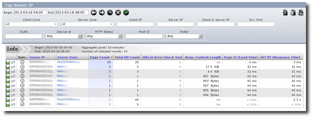
Top Reports
You can easily get the top clients, servers, applications for any traffic (all or a specific application, zone, etc.)
You can sort each top on the most adequate criteria (volume, sessions, SYNs, etc.)
This view can be accessed through Monitoring / Top Reports.
DNS Performance
SkyLIGHT PVX provides an in-depth view of name resolution events and performance (for DNS, Netbios, mDNS, etc). When troubleshooting, this view can display:
- The evolution of the DNS activity (an excessive peak may reveal a misconfiguration / infection)
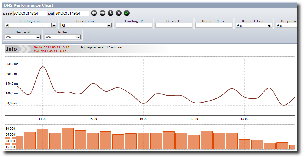
- The evolution of DNS response times which impacts the quality of experience of end users.
- Unexpected name resolution protocols (are you still using Netbios/WINS, when you thought you only rely on pure DNS? Do you have more DNS requests in error than successful ones?)
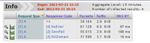
- Are some of my hosts trying to resolve out of abnormal servers? (Rest of migrations, misconfigurations, infections)
- Can I see hosts with abnormal request volumes? (infection, misconfiguration)
- Have I got some configuration issues (short TTL values, lack of caching)? Look at the DNS conversations with the largest number of transactions.
This view can be accessed through Diagnostic / DNS.
TCP Events
SkyLIGHT PVX provides an in-depth view of TCP anomalies and events. When troubleshooting, this view can display:
- TCP conversations where the sessions are not ended correctly (Timeouts, RSTs, etc) This may help you understand when you can observe disconnections, if the client or server side is responsible for it.
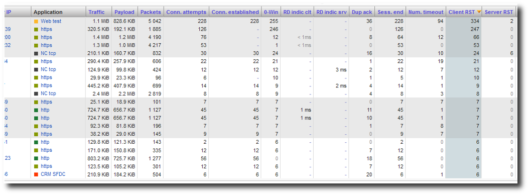
- Bad transmission rate: if the data transfer is slow for a specific application, it may, of course, be due to network congestion, retransmission issues, but also to TCP errors like 0-Windows. By looking at specific conversations, you can view whether the TCP window is being reduced and by whom (client / server).
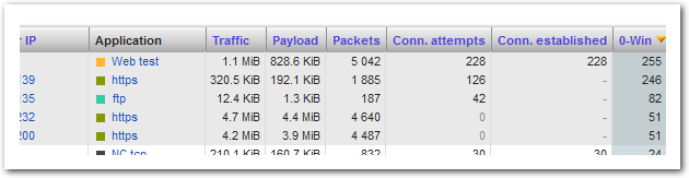
- Abnormal behaviors: by sorting the TCP events by number of SYN packets, you can easily view which machines are generating a very high volume of TCP session start, which eventually do not drive to a complete TCP session setup. If you see machines with large volume of SYN packets and few / no session setup, these machines are either misconfigured or infected.
This view can be accessed through Diagnostic / TCP events.
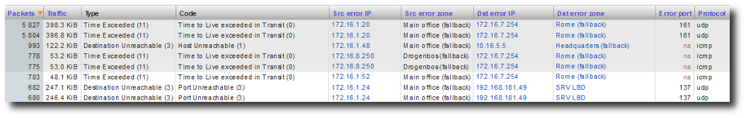
ICMP Errors
SkyLIGHT PVX provides an in-depth view of ICMP errors. ICMP errors will report the volume of flows which cannot be set up (either because the network, host, or port is unreachable). This can reveal:
- An unavailable host
- A network which is not reachable (either it does not exist - which reveals a configuration / infection issue on the source host, or it is not available - configuration issue?)
- A port which is not reachable (either the source machine is scanning or it is misconfigured and tries to reach a service which no longer exists or has been migrated).
This view is great to pinpoint configuration and infection issues.
This view can be accessed through Diagnostic / TCP events.
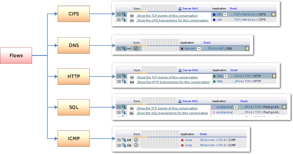
Drill Down
You can navigate between the metrics to drill down to the point where you want to analyze fine details about performance problems, or the opposite, to explore the context of such problems. You can also easily navigate to a different related metric.
You can see several labeled icons at the beginning of most result tables, that direct you to a more detailed / more general page matching a particular line.
Overview of the relation between the metrics.
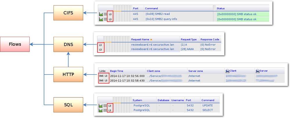
If some TCP connections are slow, it is also possible to go directly to the protocol analysis if available. If they’re actually SQL connections, an SQL icon will be available on the corresponding lines, and clicking it you will see all the SQL analysis that matches these TCP connections. Likewise for HTTP transactions or other metrics, we are able to analyze in details.
Links from flow metrics to detailed metrics.
Note
Drilldown can return no data for several reasons:
- The selected transaction does not match an activated Zone (for metrics like SQL or CIFS).
- No response has been parsed for the transaction, check the client and server packet counts for unilateral flow.
- The payload does not generate a metric flow, like keep-alive or notifications for CIFS.
A navigation between metrics that are related is available. For example, you can obtain the DNS queries that are related to a HTTP connection by clicking the “DNS” link in one of the result in the “Pages” view of the HTTP protocol section.
Links from detailed metrics back to flows.
PDF / CSV Export
On any web page of the web interface (except for the Configuration section), you will have the ability to export data either in PDF or CSV formats. As long as no query has been performed, the export buttons remain deactivated. Once a query has been run, the buttons are activated and you can export the data in the format you prefer.
In PDF, you will have a PDF document presenting the same data (tables or graphics) as the ones you got on your browser page.
In CSV, you get a text file with the corresponding data values. You can then use this CSV file on any of your own data processing. In case you have several graphics or tables on a page, you will have to choose the one you want to export the associated values.
Note
Please note that you cannot export the Matrix views into CSV files; the hierarchical nature of the Matrix does not fit into the flat structure of the CSV format.
Filters
For the full technical documentation, please see the appendix Custom Filters.
In each report page, you can filter the query on different fields. All
filters will be combined with the AND operator. When you set a filter
and send a request, the filter is saved for the current session.
For a more complex search, you can use the custom filters
input. In this field, you can combine filters with any logical operators:
(OR, AND, NOT) and can order subexpressions using
parentheses. You can filter on most of the common available fields.
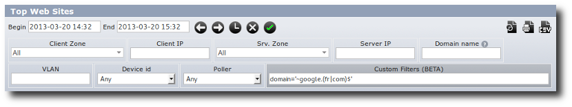
Custom Filters Example
Below are some of the available fields (the full list is in Custom Filters)
- app,
- capture.begin, capture.end,
- device,
- diffserv, diffserv.clt, diffserv.srv,
- http.host,
- ip, ip.clt, ip.srv, ip.src, ip.dst,
- mac, mac.clt, mac.srv, mac.src, mac.dst,
- os, os.clt, os.srv,
- port.srv,
- vlan,
- zone, zone.clt, zone.dst, zone.src, zone.srv
Use .clt and .srv suffixes for Client and Server in the
Application Universe which is in client/server mode. Use .src
and .dst suffixes for Source and Destination in the network
Universe which is in source/destination mode.
Here are some examples of valid expressions:
(ip=10.10.*.* or ip.srv=10.20.30.*) and os.clt='linux'zone in '/Private/Servers' or port.srv < 1024port.srv=53 or zone in '/Private/DNS'http.host='~^www.google.(fr|com)$'app='http' or app='https'
Note
zone = '/Private' selects only the flows with a client
or server zone which is exactly /Private and no other
zones.
zone in '/Private' selects /Private and any of its
subzones.
Precision mode
The precision mode is a selectbox in the request form that allows you to choose one of two ways to query the database: fast or precise. This will direct the algorithm to query the appropriate aggregate level. (See Data Aggregation for more information about aggregate levels)
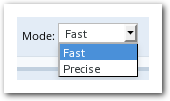
The Precision Mode Selection
- fast mode will quickly choose aggregated values (i.e., smaller resolution) to avoid scanning a large amount of data and be able to respond faster.
- precise mode will try to keep data as precise as possible. The amount of data to be scanned will be higher and so the query could take longer. This mode is useful when you want a chart with a lot of points or to query with a filter on a metric that is degraded at a higher aggregate level.
Note
There are some cases where the two modes will choose exactly the same aggregation level.
Column themes
In the Application and Network universes, you can choose between different themes of columns to be displayed in tables. The selected themes are stored in the session and used in all table views (of the above mentionned universes).
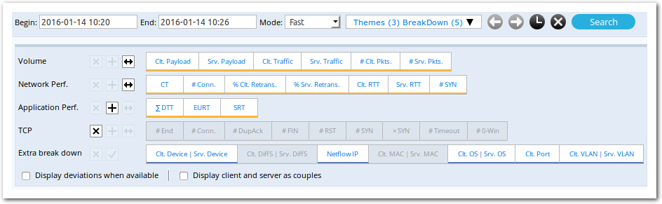
The Themes / Breakdown selection lets you choose which themes to display, and which additional breakdown columns to query.
There are four column themes:
Volume– for traffic-related metricsNetwork Perf.– for network performance metricsApplication Perf.– for application performance metricsTCP– for TCP events statistics
Each theme can either be activated to display total values (i.e., the
sum of both directions as in the Application Perf. theme displayed
above, or to display values for each direction (as in the Volume
or Network Perf. themes displayed above).
You can also choose to add extra breakdown columns. By selecting an
extra breakdown column, the resulting lines will be split
depending on the value for that column. We can see this in the
following example. The extra breakdown column Clt. Port breaks
the line of result by client port, which produces as many lines as
there are different client ports in these conversations.

A single line of result, with no additional breakdown columns.

The same query, with the extra breakdown column Clt. Port.
Additionally, you can opt to display the deviations for performance metrics. You can also choose to display both directions of a metric side-by-side.